No. R-04 · Interior painting
Color consultation for the room you actually have
Color chosen by painters with fine-arts and color-theory backgrounds, tested on your wall in your light, before a single can is opened.
Why a paint chip lies
A chip is two inches of color seen under a store’s lights, against white card, with nothing around it. Your wall is eleven feet of that color, lit by a window that changes all day, sitting next to a ceiling, a floor and a hallway that each push back. The same paint can look warm at breakfast and green by the time the lamps come on.
Undertone is where most mistakes start. A gray with a hint of violet and a gray with a hint of green sit side by side on the rack looking identical, and then one of them turns a room the color of a hospital corridor. Neighboring rooms matter too: color is read in sequence, so a yellow that is lovely alone can fight the red you see through the doorway.
Choosing from the chip rack alone is a gamble taken one expensive room at a time. A better answer is to treat color as a design decision, with someone who has been trained to see what the chip leaves out.
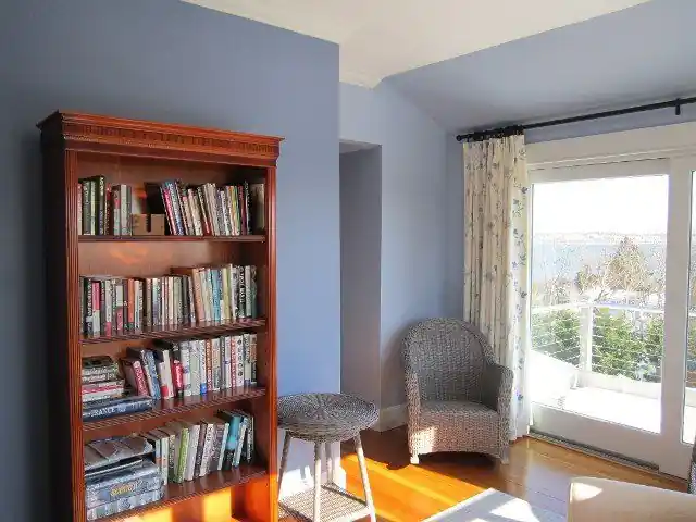
A reading corner painted in a soft lavender by Renaissance Revival Painting
Choosing the way a painter trained in color theory does
Renaissance Revival Painting lists color consultation and design options among its services, and the people behind it have skilled backgrounds in fine arts and color theory. That shows up as a method rather than a mood. Value comes first: how light or dark the color sits in the room decides how large the room feels. Temperature comes next, since warm colors advance and cool colors retreat. Then the light itself: a north-facing room in a New England winter gives a cool, thin light that turns many grays flat and blue, while a south-facing one can carry colors a shade bolder than you would dare.
Trim and ceiling are part of the palette, not an afterthought. A ceiling a half step off the wall color, trim that is warmer or cooler than the wall by design, and a sheen that changes how each surface holds the light all decide whether a room feels composed. Sample boards go on the actual wall, large and in more than one spot, and are looked at in morning, afternoon and lamplight before anyone commits.
The studio is owner-operated in Providence and has worked on interiors since 2001. Call (401) 351-4757, describe the rooms and the light they get, and the conversation starts from there.
Carrying color through a whole house
The hard part of a color scheme is rarely the first room. It is the third, where the hallway has to connect a red dining room to a sage kitchen without either one looking like a mistake. The usual answer is a thread: one value, one undertone or one trim color that runs through every space, so the rooms can differ in mood and still belong to the same house.
Strong colors earn their place by being surrounded by calmer ones. A deep red library works because the rooms around it give the eye somewhere quiet to rest. Planning that relief up front is cheaper than repainting a room that overreached.
Once the colors are chosen, the straight painting that follows is its own craft, covered under interior painting. And when a wall needs more than a flat color, a textured or glazed surface can carry a palette in a way paint alone cannot.
Owner-operated in Providence since 2001 · fine arts and color theory · free estimates
Five colors, five rooms
A color study reads what a paint does once it has a room to work in. Each note on the right comes from the photograph beside it, nothing more.
Once a palette is settled, the interior painting that follows is its own craft, and the full room gallery shows more colors in place.
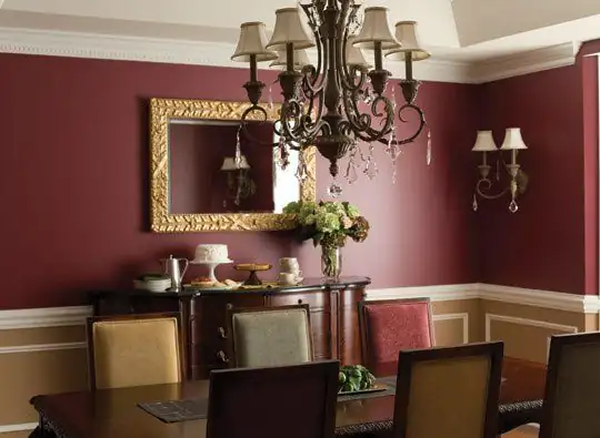
Deep red pulls a dining room in around the table and makes an ordinary dinner feel like an occasion.
A pale lavender keeps a small reading corner calm and cool without letting it go cold.
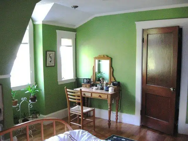
A saturated green gives a study a restful field to look into when the eye needs somewhere to go.
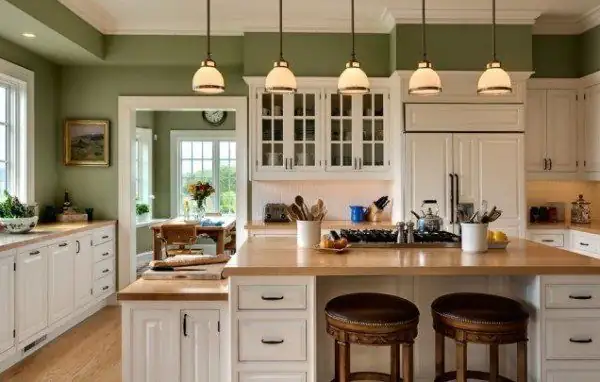
Sage reads almost as a neutral in a kitchen: green enough to freshen, gray enough to sit beside cabinets and counters.
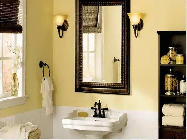
Yellow brings daylight into a small bath, even on a gray New England morning.