Choosing Wall Colors for New England Light
The same blue looks like three different colors in three rooms, and New England light is the reason.
October 16, 2026 · 4 min read
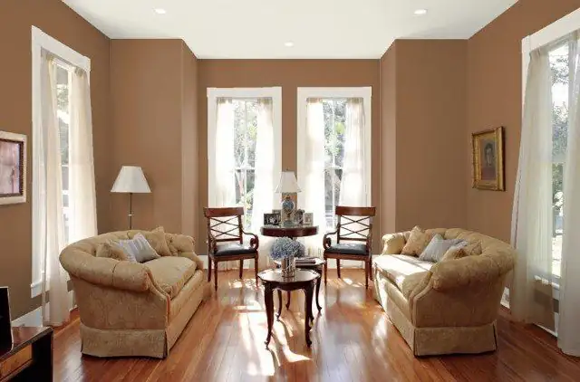
A paint chip is a lie told in a hardware store. It's lit by fluorescent tubes, surrounded by other chips, and printed on white card. The wall it's headed for sits in a room with one window, a pile of winter sky outside and a lamp that's more yellow than you think. Choosing color for a house in Rhode Island or Massachusetts means choosing it for that light, not for the store's.
What New England light does to paint
Light in this part of the country is cool and changeable. Winter days are short and low, the sun sits near the horizon, and the sky is often a flat gray that bleaches warmth out of a room. A color that looks creamy in July can turn sallow in January. A gray that felt calm in September can start to look cold and blue.
North-facing rooms get the coolest, steadiest light. No direct sun comes in, so the room is lit by sky, and sky is blue-gray. A color with a little gray in its undertone will go gloomier there. Warm colors with red or yellow in the undertone hold up better, and they keep the room from feeling like a refrigerator. This is where a deep, saturated color can surprise people: a rich red or a warm gold in a north room often looks better than a pale one, because the color has enough strength to stand up to the cool light.
South-facing rooms are the opposite. They get warm, bright light much of the day, and they can take cooler colors that would feel chilly elsewhere. Pale blue-greens, soft grays and crisp whites work there. East rooms are bright and warm in the morning and flat by afternoon. West rooms are dim early and golden late. The same wall will have two or three personalities over a day, and you'll want to meet all of them before you commit.
Undertones are the whole game
Every neutral is secretly a color. A beige leans pink, yellow or green. A gray leans blue, purple or green. A white leans warm or cool. You don't see this on its own, but you see it the moment the paint sits next to anything else: a wood floor, a granite counter, the tile in the bath. Pink-leaning beige beside a yellow floor looks dirty. Blue-leaning gray beside warm wood looks cold.
Here's a simple test. Hold a sample next to something that's pure white, like a sheet of printer paper. The paper shows you what the sample is leaning toward. Do it again next to the flooring and the largest piece of furniture. If the undertone clashes with what's already in the room, move on to another color, don't try to fix it.
This is where color theory pays for itself. Colors change depending on their neighbors, so a green looks greener beside red and grayer beside orange. A wall color is never seen alone. It's seen next to trim, ceiling, floor, curtains and whatever's outside the window. Renaissance Revival Painting works from backgrounds in fine arts and color theory, and most of what we do in a consultation is this: reading how one color will behave beside the others in your particular room.
Trim and ceiling
Trim and ceilings get chosen last and matter more than people expect. Bright white trim against a soft wall color makes the wall look dingy by comparison. A trim color just a shade off the wall, or one that shares the wall's undertone, looks calmer and more finished.
Ceilings are usually painted a flat, light color. A pure white ceiling over a warm wall can feel cold and cut the room in half. Taking the wall color and lightening it a few steps gives a ceiling that belongs to the room. In a room with a low ceiling, a slightly lighter ceiling opens the room up. In a tall room, a ceiling in a deeper tone can bring the space down to a cozier scale.
Why sample boards beat chips
Skip the tiny chip and paint a real sample. The best way is to paint a board at least a couple of feet square, with two coats, and move it around the room. Look at it on each wall. Look at it in the morning, at midday and at dusk. Look at it with the lamps on. Look at it on a gray day, since those will be most of them.
A board is better than a swatch painted straight onto the wall, because a swatch is surrounded by whatever color was there before, and that color distorts what you see. A white-edged board on a neutral background shows you the color alone. Leave it up through a gray afternoon and trust what you see then.
A quick summary of how to choose
- Note which way the room faces and when you use it most.
- Check the undertones against the floor, counters and large furniture.
- Choose trim and ceiling at the same time as the wall, not afterward.
- Paint big sample boards and live with them on a gray day and a night.
- Compare finalists together, then pick the one that still looks right at dusk.
Renaissance Revival Painting offers color consultation as part of its interior painting, along with design options and the prep that goes before any color goes up. Call (401) 351-4757 or use the contact page to set up a free estimate.
Renaissance Revival Painting, (401) 351-4757
Call (401) 351-4757More articles
Venetian Plaster Versus Faux Finish Paint for Your Walls
Plaster is something you feel with your hand; a faux finish is something you read across the room, and each belongs in different rooms.
Planning a Mural for a Child's Room or a Family Room
A good mural starts with a decision about the wall, not a picture, and the picture comes second.